
UI, Text, and Buttons
A button has a visible label and an area you can press. Its components define both. Transform controls placement and interaction bounds, while Text and Sprite draw its appearance. UI Interaction lets it receive pointer activation.
The Button preset creates these components together, ready for you to edit in the Scene.
Add and Edit a Button
Open an existing 2D Scene with the playtest stopped.
- Select Place. Under Add Scene Content, keep Placement Space at Object Default.
- Under New Scene Object, choose Button. Click an empty area of the Scene preview once.
- Select Select, then choose the Button in Scene Explorer > UI Objects.
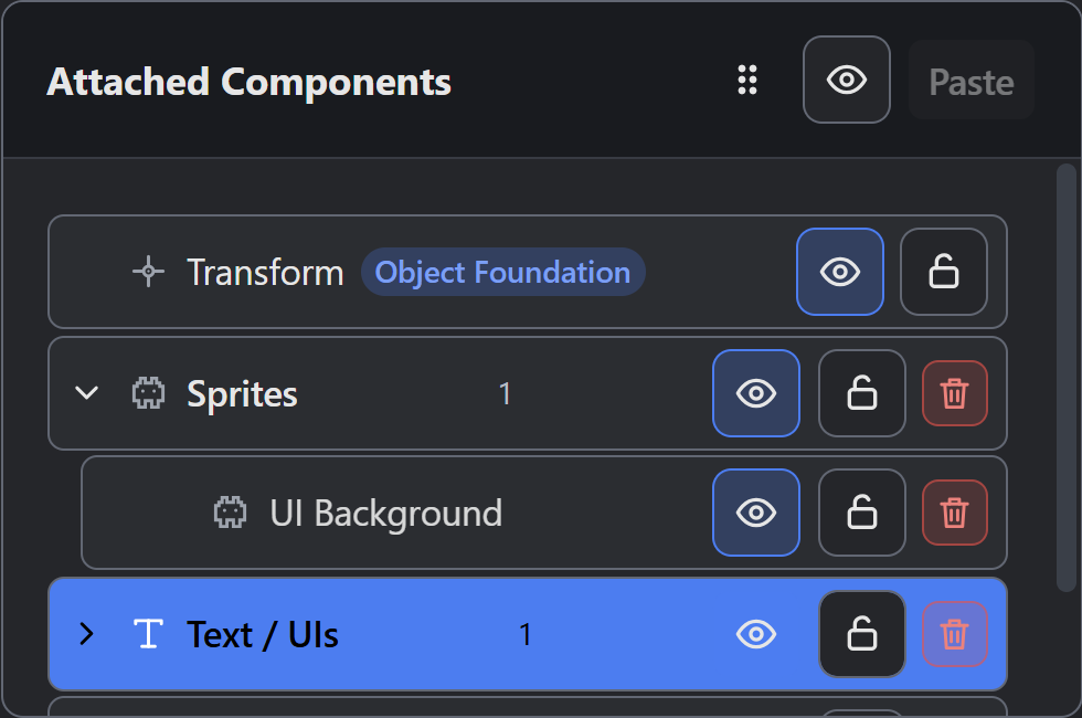
- In Properties, select Edit Components and Logic… to open the Scene-local Object’s components.
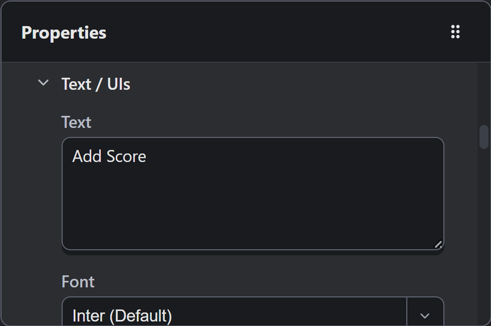
- Under Attached Components > Text / UIs, select its Text component.
- Set Text to
Add Score, Font Size to24, and Alignment to Center. Keep Text Bounds at Fit to Text. - Select Done. Reopen Edit Components and Logic… to check the label.
The label should still read Add Score when you reopen its Text component. Save when you’re ready.
Scene-local editing keeps this definition with the Scene. When several buttons should share the same component definition, use an Object resource for those instances. See Object Editor for reusable Objects.
Attach compatible 2D Logic to run your chosen Actions when the player activates this button.
Place a Screen Control
Window / UI presentation keeps a control relative to the game window, independent of the world Camera. Inspect the Button’s Transform for presentation and bounds.
- Select the Button’s row in Scene Explorer to show its placement settings.
- Set Screen Anchor to Bottom Center.
- Set Screen Offset (px) to X
0, Y32, placing it above the anchor. - Keep screen scale at
1. Leave Active in Play Mode and Visible at Game Start enabled.
In the current project convention, positive Y moves upward, putting this control above the lower center. Choose the anchor first. Changing it can re-express offsets to preserve the existing position.
Check the smallest supported game window: a control that fits one window can crowd another. Display and Rendering explains output size and scaling.
The visible background and the interaction area have separate bounds. When you lengthen the label, the interaction target keeps its own size. Inspect Transform after changing the background or label size, then test each edge in play.
Connect and Check Activation
Create a compatible 2D Logic Component, then connect UI Activated to the Actions you want this Button to run.
Select the Button in Scene Explorer. In Properties, expand Logic and choose that resource under Add Logic. Keep the attachment’s Enabled switch on.
Create a Logic Component covers resource creation and connections. Use Saving and Loading Progress for save and continue controls.
Start with one button and one attachment, using a debugger message to count each activation.
- Start Debug Play and open Console.
- Press and release inside the button, then check that its Action runs once.
- Press inside, drag outside, then release. The canceled press should leave the diagnostic count unchanged.
- Press elsewhere, then release over the button without beginning a new press. This should not activate it.
- Test points inside and outside its bounds, then repeat after resizing the window.
A pointer activation starts and ends on the same eligible target. Hidden Objects cannot receive it. An inactive Object or disabled UI Interaction component also removes eligibility for this pointer test.
Test keyboard and controller input separately.
Add Passive Labels
A score label uses Transform and Text, with Window / UI presentation and the UI render layer. Leave UI Interaction absent for a passive label.
Text and Live Values covers fonts, live expressions, wrapping, and the units a Text component uses.
| Element | Anchor to Try | Offset to Check |
|---|---|---|
| Score near the upper center | Top Center | Negative Y moves down in the current convention |
| Corner control | Matching corner | Move inward from both edges |
| Centered menu | Center | Start with X 0, Y 0 |
| Lower control | Bottom Center | Positive Y moves up in the current convention |
Keep each interactive area deliberate: a large invisible panel can cover another control’s target. Test overlapping controls in the actual game.
Troubleshooting
| Symptom | Check |
|---|---|
| Button appears but does nothing | Choose compatible Logic under Add Logic, enable its attachment, and connect UI Activated to an Action |
| Invisible space responds | Compare Transform bounds with the visible Sprite and Text |
| Release does not activate | Check that the press began on the same enabled, visible target |
| Counter follows the Camera | Inspect Presentation Space; a screen label uses Window / UI |
| Button moves away from its intended edge | Check the anchor and both offset signs |
| One press runs several Actions | Check duplicate controls, attachments, and Event connections |
| Label overlaps another control | Check Text width and the surrounding layout at the smallest window |
The UI Interaction Reference lists component fields; Logic Troubleshooting covers attachment and Event checks when a control fails to respond.
For a built example, Weighted Maze’s sidebar combines passive labels and interactive controls. Its cards define their bounds separately.
Myth Engine Documentation